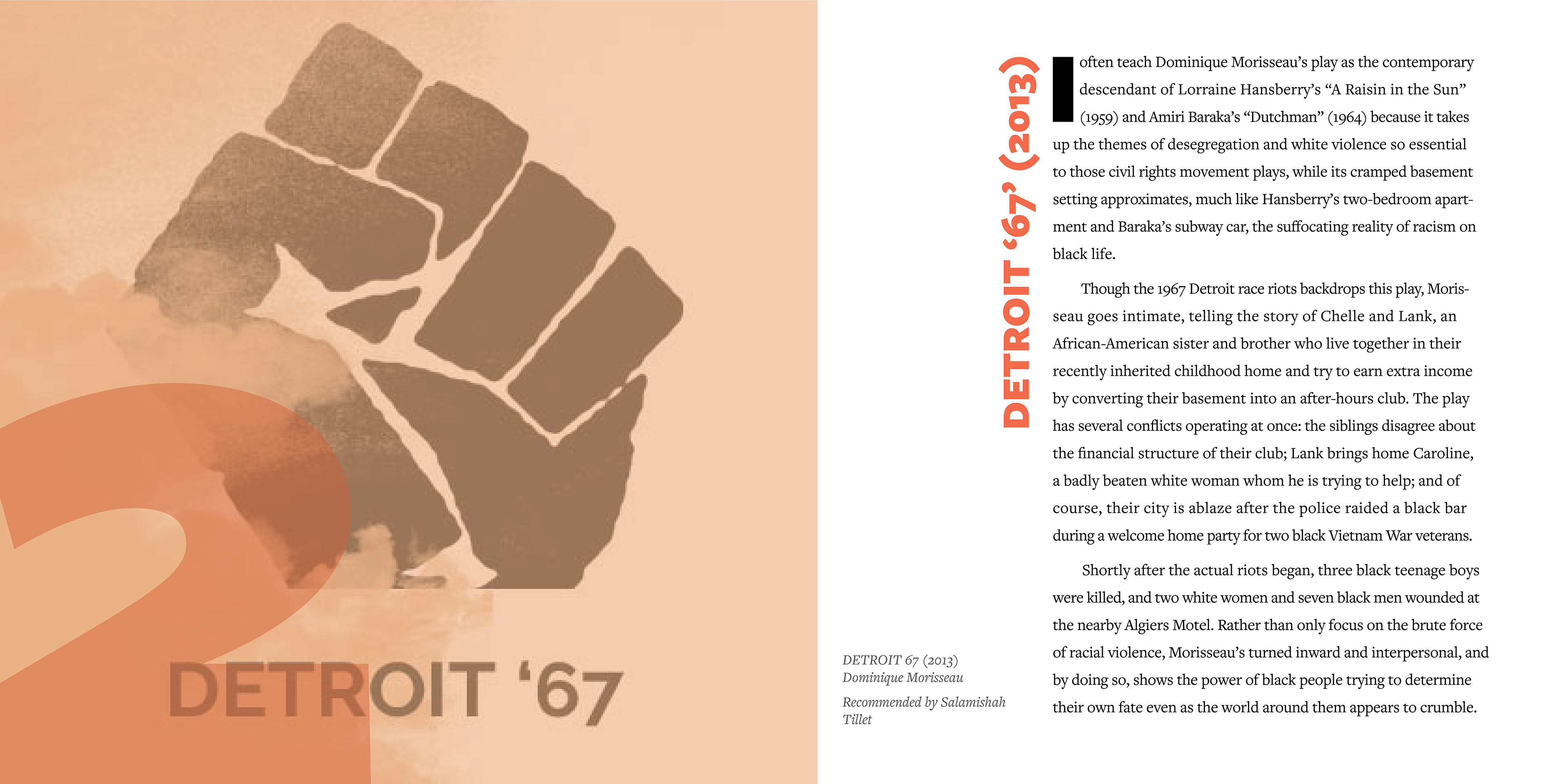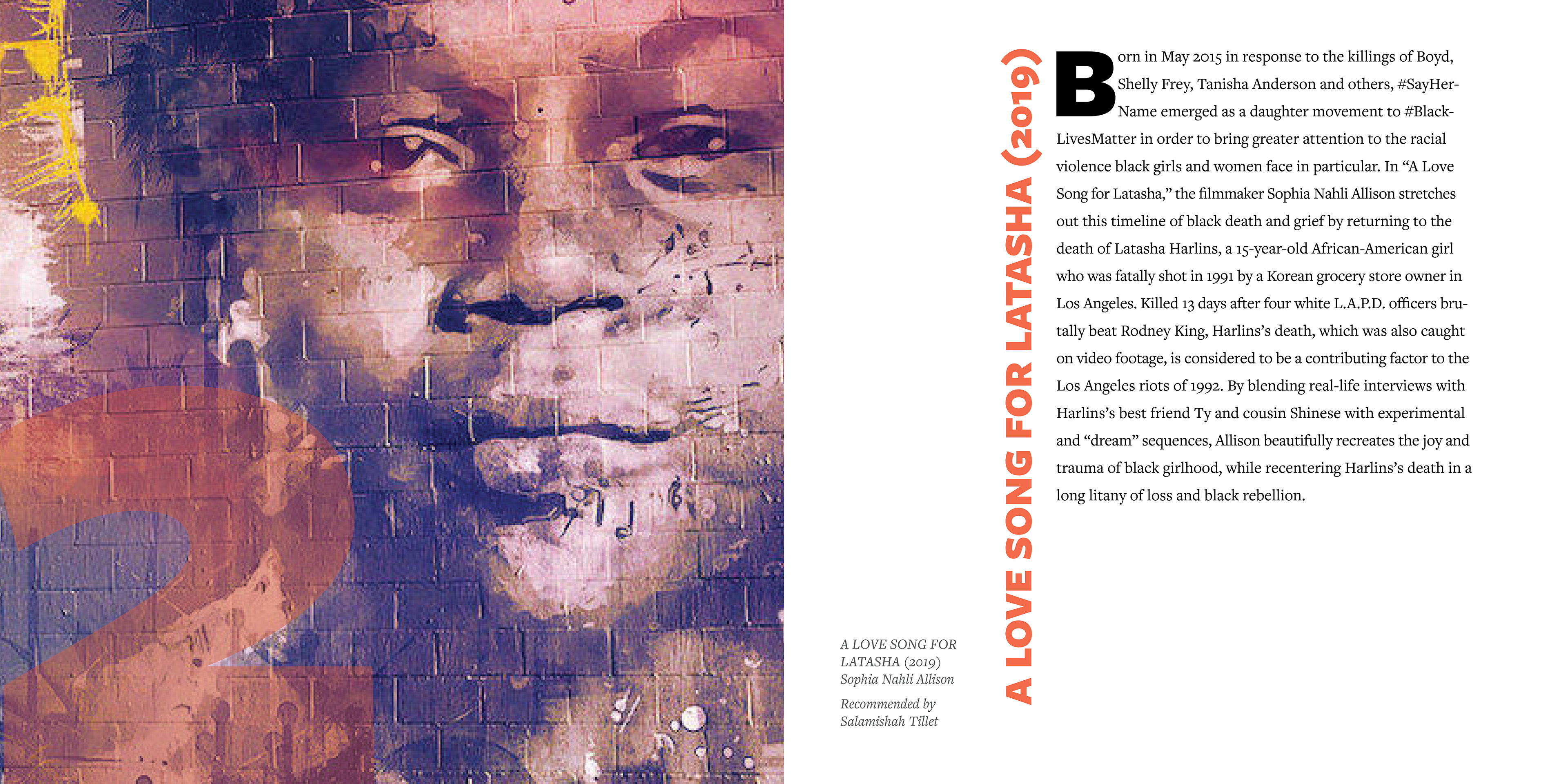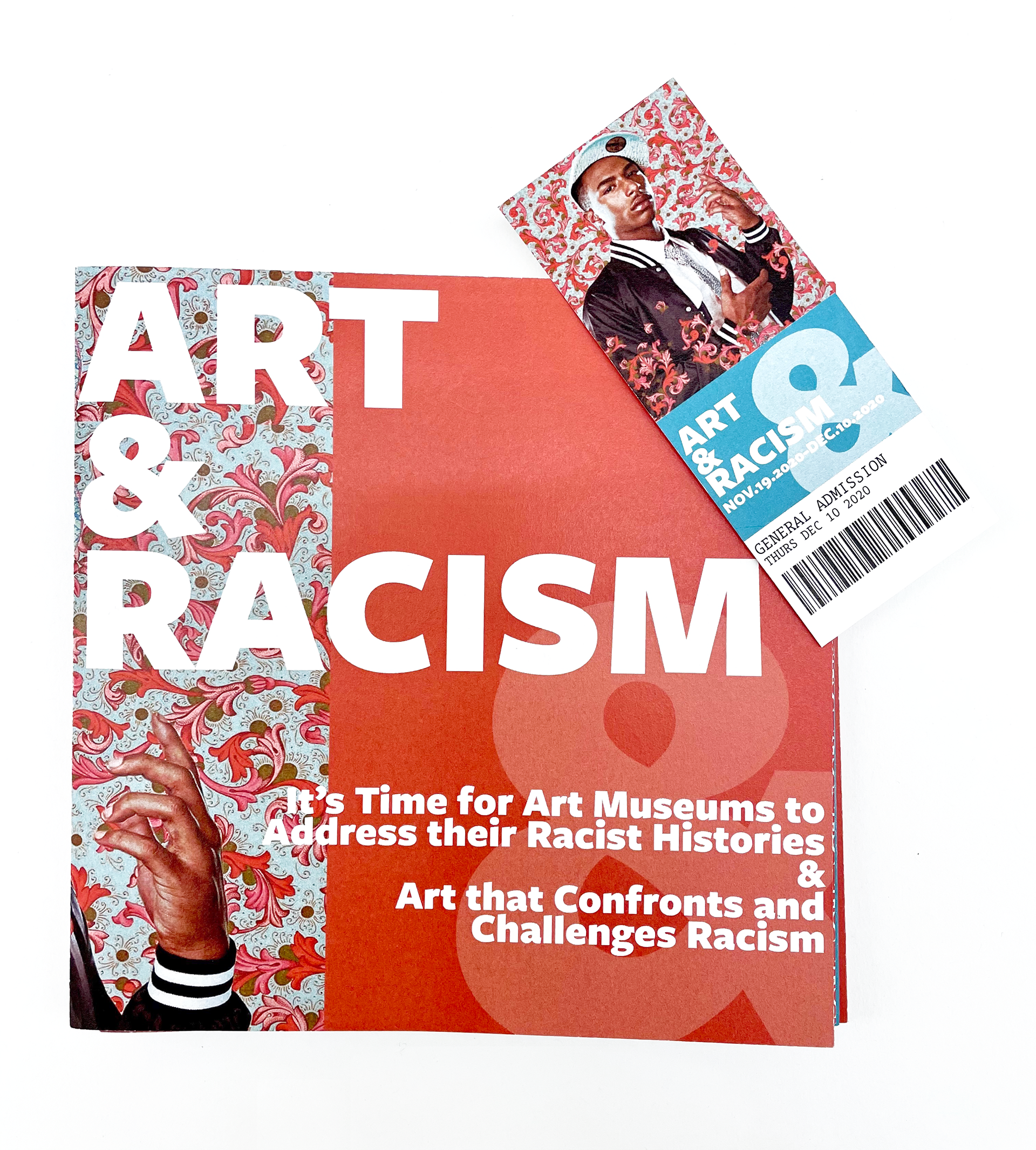
This book contains two articles– one about racism in art museums and one that suggests anti-racist art. I referenced museum exhibition guide and pamphelet design. The articles are laid out with the first one on one side of the accordion fold mirroring an overview and explanation of an exhibition. The second article is read on the other side and opposite direction of the first. The second article mirrors exhibition guides with full bleed pictures of the artwork and titles and in an gallery-like style. The captions are based off descriptions seen in museums. The 9x9 column grid is a reference to the design and grid system used by the British Museum. The colors and overall concepts are drawn from graphic design for the MoMA. The typefaces used are FreightSans Pro and FreightText. These same typefaces are used by National Museum of African American History & Culture, and the typefaces are designed by a black designer, Joshua Darden for Phil’s Fonts. I chose to bind the book in an accordion style to reference typical binding of exhibition guides and pamphlets. The book is 6.75 x 6.75, the size of a MET guidebook and small enough to be easily carried around a museum.