Issue: Create a branding system for Petra, Jordan including a logo mark, business card, and poster that encapsulates its essence and rich history that feels true to the place while appealing to tourists from all over the world.
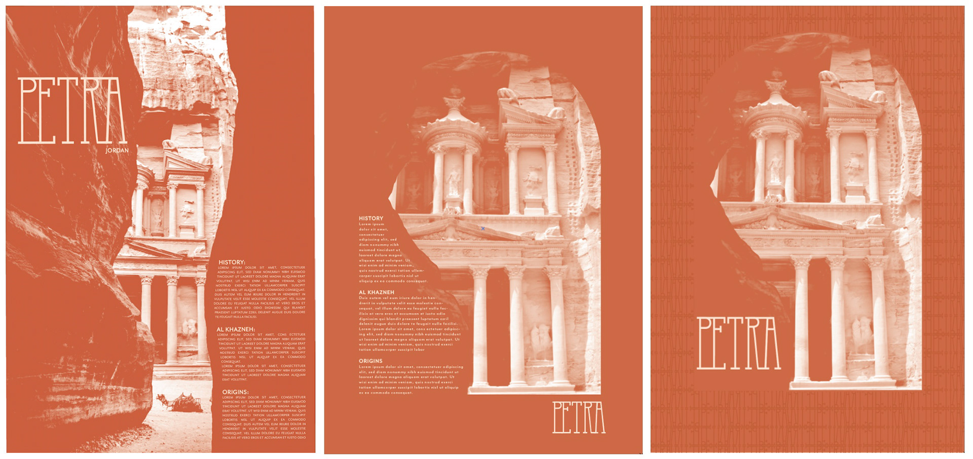
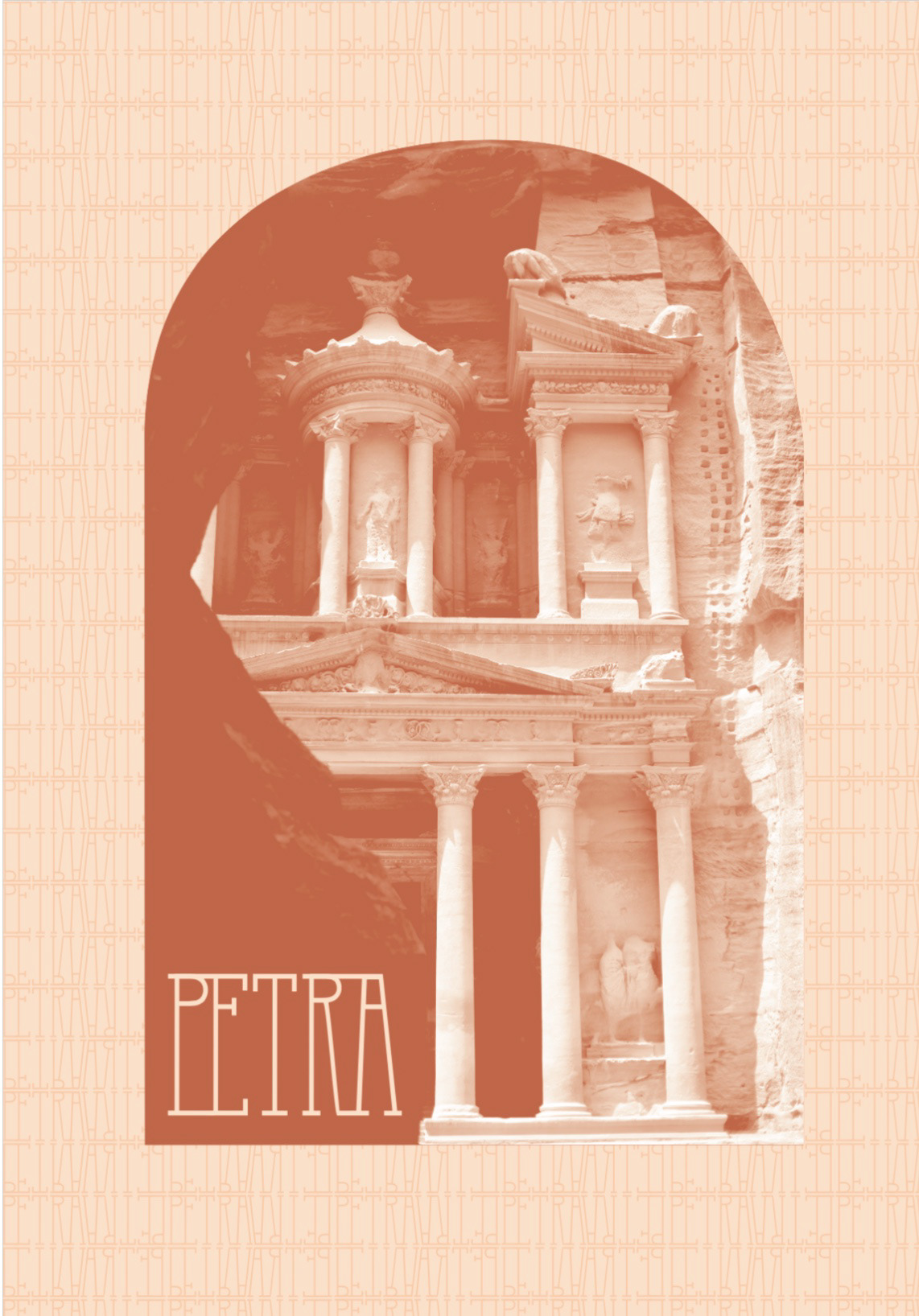
Insight: Petra is one of the seven wonders of the world, boasting a rich history and unique architecture. My research revealed three key imperatives that would define Petra and it's branding: it's significance as an archaeological and architectural treasure, it's nickname The Rose City, and Arabic typography.
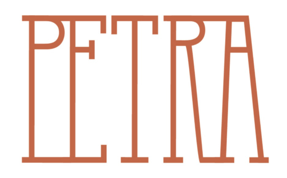
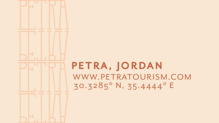
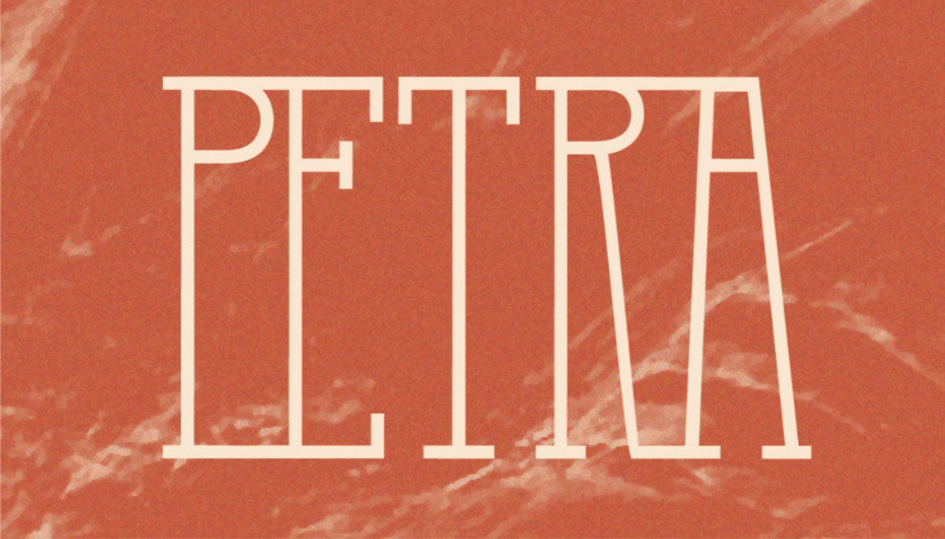
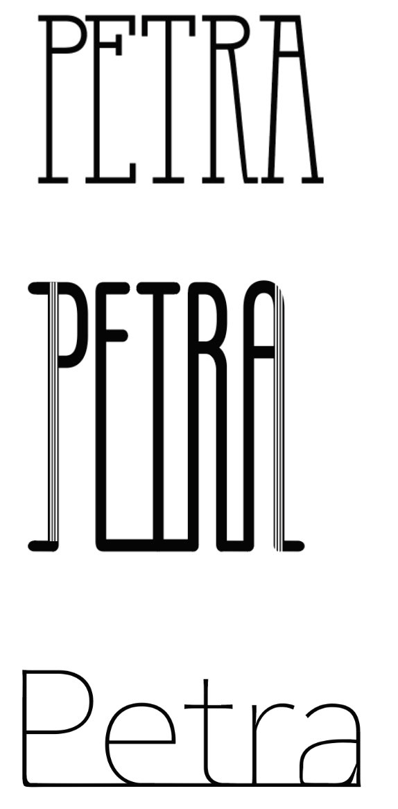
Execution: The logomark is inspired by the architecture of Petra’s most famous building, Al Khazneh-- the type is stretched to mirror the columns and structure of the building carved into the mountain. The letters in the wordmark are connected in reference to the fluidity of Arabic typography. The color palette is defined by it's nickname, The Rose City, due to the blushing pink sandstone the city is carved from. The business card features a manipulated image taken from rocks in Petra. The back features a pattern expanded from the logomark. The secondary typeface is a nod to typography in old Petra archeology books and records.
Process
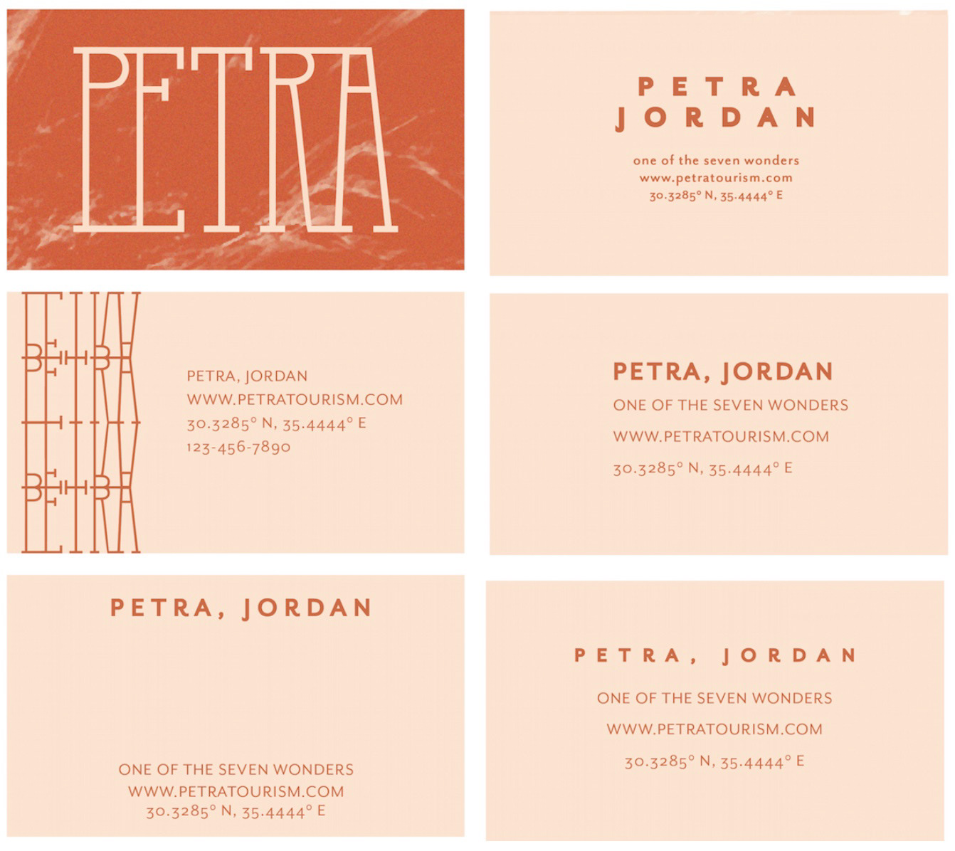
Business Card Studies
Logo Mark Studies